
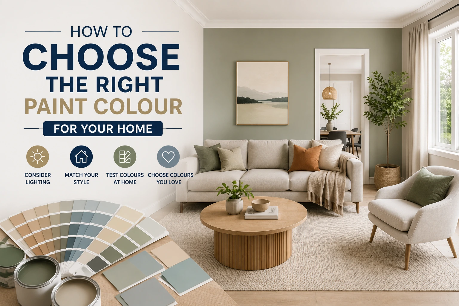
Choosing a paint colour sounds simple until you are standing in front of a wall of swatches wondering why the shade that looked perfect in the store looks completely different on your walls at home. Colour selection is one of the most common sources of frustration for Adelaide homeowners undertaking a repaint, and it is almost always driven by the same set of misunderstandings about how light, undertones, and room function interact with colour.
This guide walks you through the process that SA Quality Painting uses when helping Adelaide clients select colours for their homes. Whether you are planning a single room refresh or a whole-home repaint, the principles here will help you make decisions you will be confident in for years to come. If you are also considering the scope and cost of the painting project itself, our
Complete Guide to Residential House Painting in Adelaide covers preparation, product selection, and what to expect from the process.
Why Paint Colours Look Different on Your Walls Than on the Swatch
This is the single most common complaint SA Quality Painting hears from homeowners who have attempted to choose colours independently. A colour that reads as a clean, soft white on a small chip looks yellow, pink, or grey once applied across an entire wall. There are three main reasons this happens:
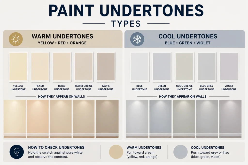
Undertones
Every paint colour has an undertone, a subtle secondary hue that becomes more visible as the colour is applied at scale. A white with a yellow undertone will warm up significantly on a large wall. A grey with a blue undertone will read as noticeably cool in a south-facing room. Undertones are often invisible on small swatches but impossible to ignore once the paint is on the walls.
The way to identify undertones reliably is to hold the swatch against a pure white surface and look at the colour of the contrast. Warm undertones (yellow, red, orange) pull toward cream. Cool undertones (blue, green, violet) push toward grey or lilac. Understanding this before you commit to a colour saves the cost of a repaint.
Light Direction and Quality
Adelaide homes receive different quality of natural light depending on the direction each room faces. North-facing rooms get warm, direct sun for most of the day. South-facing rooms receive cool, indirect light. East-facing rooms get warm morning light and cool afternoons. West-facing rooms reverse that pattern.
The same paint colour in a north-facing Adelaide living room and a south-facing bedroom will read as two distinctly different colours. Warm tones become more intense in north-facing rooms. Cool tones can look flat or cold in south-facing rooms without a warm undertone to balance them. Always assess your shortlisted colours in the actual room at different times of day before committing.
Surrounding Materials and Finishes
Paint colour does not exist in isolation. It reacts to your flooring, cabinetry, furnishings, and ceiling colour. A soft white wall will look cooler next to warm timber floors and warmer next to cool grey tiles. This interaction is not a flaw in the paint. It is physics. Assessing a colour in context, against the actual materials in the room, is essential.
SA Quality Painting recommends always painting two or three A4-sized patches of your shortlisted colours on the actual wall, not on cardboard or paper held against the wall. Leave them for 48 hours and assess in morning light, afternoon light, and under artificial light before making a final decision.
Understanding Colour Psychology in Adelaide Homes
The colours we choose for our homes have a measurable effect on how we feel in those spaces. This is not interior design mythology. Research published in journals including Frontiers in Psychology and Environment and Behavior consistently shows that colour influences mood, perceived room size, and even cognitive performance. For Adelaide homeowners, this translates to practical choices by room:
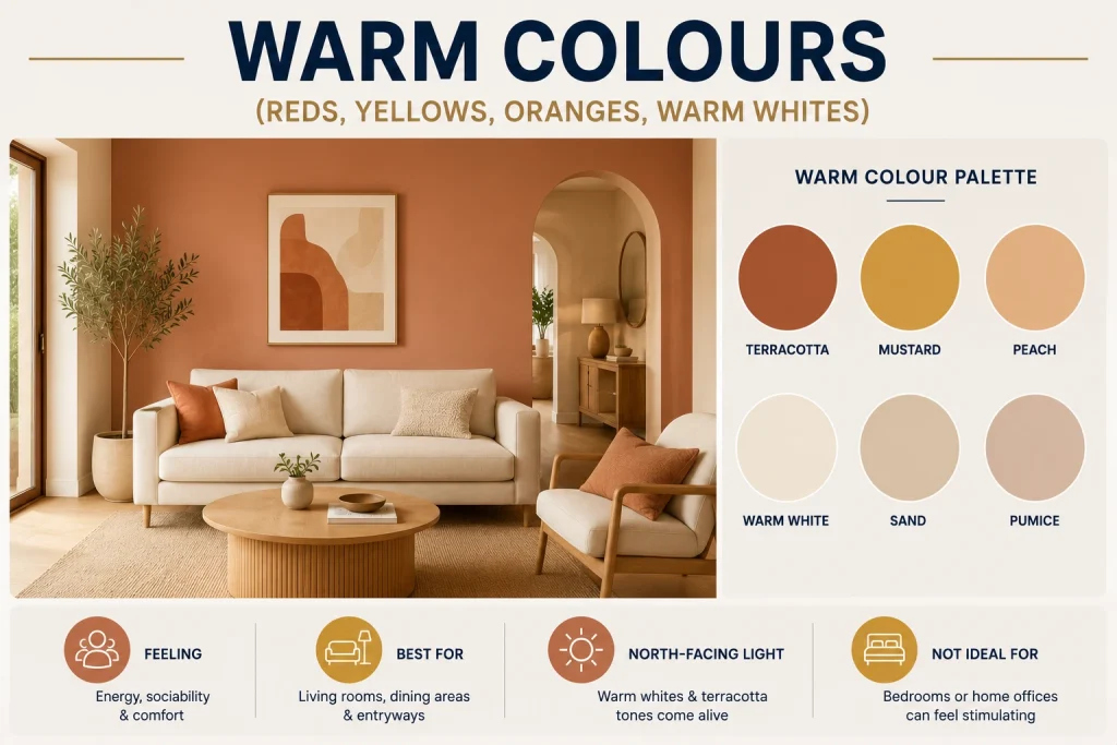
Warm Colours (Reds, Yellows, Oranges, Warm Whites)
Warm tones create feelings of energy, sociability, and comfort. They are well suited to living rooms, dining areas, and entryways where you want a space to feel welcoming and lively. In an Adelaide home with generous north-facing light, warm whites and soft terracotta tones come alive during the day. However, warm tones in bedrooms or home offices can feel stimulating rather than restful.
Cool Colours (Blues, Greens, Greys, Cool Whites)
Cool tones promote calm, focus, and a sense of spaciousness. They work particularly well in bedrooms, bathrooms, and home offices. Soft blue-greens and pale greys are consistently among the most popular interior choices for Adelaide homes, partly because they contrast naturally with the warmth of Adelaide’s outdoor light and provide a restful counterpoint. In south-facing rooms, cool tones need careful handling to avoid feeling cold or clinical.
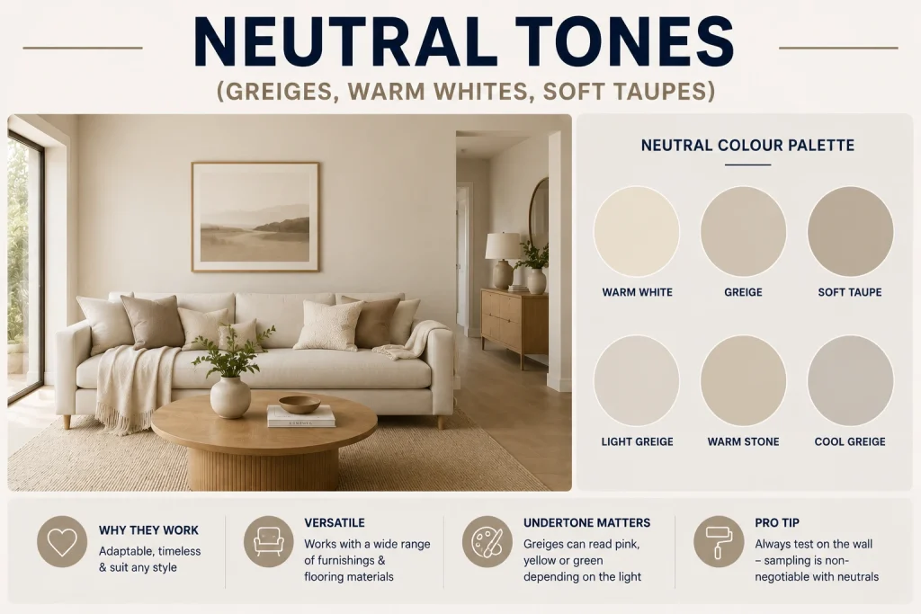
Neutral Tones (Greiges, Warm Whites, Soft Taupes)
Neutral tones remain the most popular interior colour choice in Australia for good reason. They are adaptable, they date slowly, and they work across a wide range of furnishing styles and flooring materials. The key with neutrals is understanding their undertone. A greige (grey-beige hybrid) can read as distinctly pink, yellow, or green depending on the light. Sampling on the wall is non-negotiable with neutrals.

Choosing Paint Colours Room by Room
The table below summarises SA Quality Painting’s recommended tone and sheen approach by room for Adelaide homes, based on typical light conditions and room function:
| Room | Recommended Tones | Why It Works | Sheen Level |
| Living and dining | Warm whites, soft greiges, sage | Flexible across lighting conditions, timeless | Low sheen |
| Kitchen | Crisp white, light grey, soft blue-grey | Clean and hygienic feel, reflects light well | Semi-gloss |
| Master bedroom | Warm neutrals, blush, dusty blue | Calming and restful, works in low light | Low sheen or flat |
| Kids bedroom | Soft yellows, light mint, sky blue | Cheerful without being overwhelming | Low sheen (washable) |
| Bathroom | White, pale grey, soft blue | Fresh and clean, pairs well with tiles | Semi-gloss |
| Hallway and entry | Mid-tone neutrals, warm white | Hides marks, creates a welcoming transition | Low sheen |
| Home office | Soft green, warm white, light grey | Focus-enhancing, reduces eye strain | Low sheen or flat |
Living Areas and Open Plan Spaces
Open-plan living, dining, and kitchen combinations are common across Adelaide’s newer housing stock and renovated character homes. The challenge here is choosing a colour that reads consistently across zones that may have different light exposure. A single neutral tone throughout, with variation introduced through furnishings and feature walls, is almost always more successful than different colours for each zone in an open plan.
Warm whites such as Dulux Antique White USA, Haymes Whisper White, and Taubmans Natural White are perennial choices for Adelaide open-plan areas because they feel clean without reading as stark, and they work equally well in natural and artificial light.
Bedrooms
Bedrooms benefit from colours that promote rest. Dusty blues, warm taupes, soft sages, and blush tones consistently outperform bright or saturated colours in sleep environments, according to colour psychology research. For Adelaide master bedrooms with north or west-facing windows, a colour with a cool undertone will be tempered by the warm light and read as balanced rather than cold.
Children’s bedrooms offer more creative latitude. Soft, unsaturated versions of bright colours, pale yellows, light mints, sky blues, and soft terracotta work well without the visual intensity of fully saturated children’s colours. Using a washable low-sheen product is important given the contact intensity in kids’ rooms.
Kitchens and Bathrooms
White and near-white tones dominate kitchens and bathrooms because they reinforce perceptions of cleanliness and make smaller spaces feel larger. However, soft blue-greys and pale greens are increasingly popular as second-choice options, particularly in larger kitchens with good natural light. The sheen level in wet areas should always be semi-gloss for durability and moisture resistance, regardless of colour choice.
Hallways and Entry Areas
Hallways in Adelaide homes, particularly in the character suburbs, tend to be narrow with limited natural light. A light, slightly warm neutral makes a hallway feel wider and more welcoming. Avoid cool greys in narrow hallways with little natural light. They can make the space feel oppressive rather than elegant. For high-contact surfaces like hallway walls, a washable low-sheen product is essential.
How to Work with Paint Brand Colour Ranges in Adelaide
The three paint brands most commonly specified for Adelaide homes are Dulux, Haymes, and Taubmans. Each has a distinct colour philosophy and range of neutrals. Here is a practical overview:
Dulux
Dulux is the most widely used premium paint brand in Australia. Their Colour Forecast range, updated annually, reflects global and local interior design trends and is a reliable starting point for homeowners who want a contemporary palette. Dulux’s Wash and Wear Low Sheen is the standard interior product for most Adelaide applications.
Popular Dulux colours in Adelaide homes include Antique White USA (warm white, highly versatile), Vivid White (clean white, suits contemporary homes), Hog Bristle (warm taupe, works well in character homes), and Tranquil Retreat (soft blue-green, popular for bedrooms). All are available in SA Quality Painting’s approved supplier network.
Haymes
Haymes is an Australian-owned paint manufacturer with a strong presence in South Australia. Their colour ranges tend toward warmer, earthier tones that suit Adelaide’s built environment and outdoor palette well. Haymes Whisper White and Natural Linen are widely used across Adelaide residential projects. Haymes products are available in SA Quality Painting’s standard specification.
Taubmans
Taubmans offers a broad range of interior colours at a competitive price point. Their Endure range performs well in high-traffic interior applications. For Adelaide homeowners who want a quality finish at a slightly lower product cost, Taubmans is a credible option for living areas and bedrooms. SA Quality Painting uses Taubmans where the client’s brief and budget call for it.
All three brands offer free colour consultation tools online, including room visualisers that let you upload a photo of your space and preview colours digitally. These are useful for shortlisting, but they are not a substitute for physical samples on the actual wall, where lighting conditions are authentic.
The Role of Sheen Level in Colour Perception
The sheen level of a paint affects not just durability but how the colour reads on the wall. Higher sheen levels reflect more light, which intensifies the colour and makes it appear slightly lighter and more saturated. Lower sheen levels absorb more light, which softens the colour and makes it appear slightly more muted.
- Flat or matte: softest colour rendition, ideal for ceilings and feature walls where hiding surface imperfections matters more than washability
- Low sheen: the standard choice for most Adelaide interior walls, a good balance between colour accuracy, durability, and ease of cleaning
- Semi-gloss: intensifies colour slightly, best for kitchens, bathrooms, trims, and doors where moisture resistance and washability take priority
- Gloss: highest sheen and most intense colour rendition, used on doors, skirting boards, and feature elements, not recommended for large wall areas
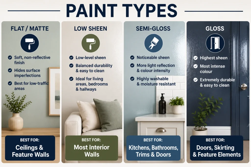
When sampling colours on the wall, always use the actual sheen level you plan to specify. The same colour in flat and semi-gloss can read as noticeably different once applied, which is another reason paint-on-the-wall sampling is essential rather than relying on swatch chips.
Feature Walls: When They Work and When They Do Not
Feature walls divide opinion in interior design circles, but they remain popular in Adelaide homes because they allow homeowners to introduce a bolder colour or finish without committing to it across an entire room. Done well, a feature wall adds depth and a focal point. Done poorly, it can feel arbitrary or unbalanced.
When a Feature Wall Works
- Behind the bed head in a bedroom, where it anchors the room’s focal point naturally
- Behind a freestanding bathtub or vanity in a bathroom, where it creates a spa-like emphasis
- On the wall facing the entry in a living room, where it creates an immediate visual statement
- In a hallway, where a single coloured wall can make a narrow space feel more intentional
When to Avoid Feature Walls
- In small rooms where a bold feature wall reduces the sense of space rather than enhancing it
- In open-plan spaces where the feature wall creates a visual break that interrupts the flow of the room
- When the chosen colour has a dramatically different undertone to the rest of the room, which can make the feature wall look like a mistake rather than a design decision
SA Quality Painting advises clients on feature wall placement as part of our pre-project colour consultation. Getting the wall selection right before painting begins avoids the cost and disruption of repainting a feature wall that does not work as expected.
When to Book a Professional Colour Consultation
Most Adelaide homeowners benefit from a professional colour consultation if they are planning a whole-home repaint, if they are working with complex light conditions (multiple orientations, limited natural light, or a mix of both), or if they have tried to select colours independently and found the results disappointing.
SA Quality Painting offers colour consultation as part of our full residential painting service. Our team assesses your home’s light conditions, existing materials and furnishings, your style preferences, and your budget, then provides specific product and colour recommendations that work together across the home.
For Adelaide homeowners planning both interior and exterior colour selection, our exterior painting blog on How Long Does Exterior Paint Last in South Australia also covers how product selection and colour interact with SA’s climate conditions outdoors, which is worth reading alongside this guide if you are planning a full home repaint.
Frequently Asked Questions: Choosing Paint Colours in Adelaide
How many colours should I use throughout my home?
Most interior designers recommend a palette of three to five colours for a whole-home scheme: one primary neutral for the majority of walls, one or two secondary tones for specific rooms or feature applications, and one consistent colour for all trims and ceilings (typically a clean white). More than five colours in an open-plan home can feel disjointed.
Should my ceiling always be white?
White ceilings are the default for most Adelaide homes because they reflect light and make rooms feel taller. However, a ceiling painted the same tone as the walls (or slightly lighter) can make a room feel more cohesive and enveloping. This works particularly well in bedrooms and home offices where a cocooning effect is desirable. High-gloss white ceilings in rooms with uneven plasterwork will highlight every imperfection. A flat white ceiling paint hides surface irregularities far more effectively.
What is the most popular interior colour in Adelaide right now?
Based on SA Quality Painting’s project work across Adelaide, warm whites and soft greiges remain the most consistently requested interior colours. Dulux Antique White USA and Haymes Whisper White are perennial choices. Among accent and feature wall colours, warm sage greens, dusty blues, and deep charcoals have been growing in popularity across Adelaide’s inner and middle ring suburbs since 2022.
Can I use dark colours in a small room?
Yes, and in many cases a deep, saturated colour in a small room creates a more interesting and intentional space than a pale colour applied in an attempt to make the room look larger. A small study or powder room painted in a deep navy or forest green can feel sophisticated and deliberate. The key is commitment: half measures with dark colours in small spaces tend to look unfinished.
How do I match new paint to existing colours in my home?
The most reliable method is to take a chip of the existing paint, removed from an inconspicuous area, to a paint supplier for spectrophotometer colour matching. SA Quality Painting can organise this as part of a project. Attempting to match by eye from memory or from a phone photo is rarely accurate enough to produce a seamless result on the wall.
Book a Colour Consultation with SA Quality Painting
Choosing the right paint colour is one of the most impactful decisions in any home repaint, and it does not need to be stressful. SA Quality Painting offers professional colour consultation as part of our residential interior painting service across Adelaide. We visit your home, assess your light conditions and existing materials, and provide specific, confident colour recommendations you can rely on.
To book a consultation or request a free interior painting quote, visit our website or contact us directly.
Call: 0415 605 744 | Email: info@saqualitypainting.com.au | saqualitypainting.com.au